THE CLIENT
About the Project
AFHSC offers a better alternative to assisted living. They offer small form assisted living facilities known as “adult family homes”. Adult family homes are residential homes that are a better alternative to institutional senior care options.
BUSINESS CONTEXT
Project Goals
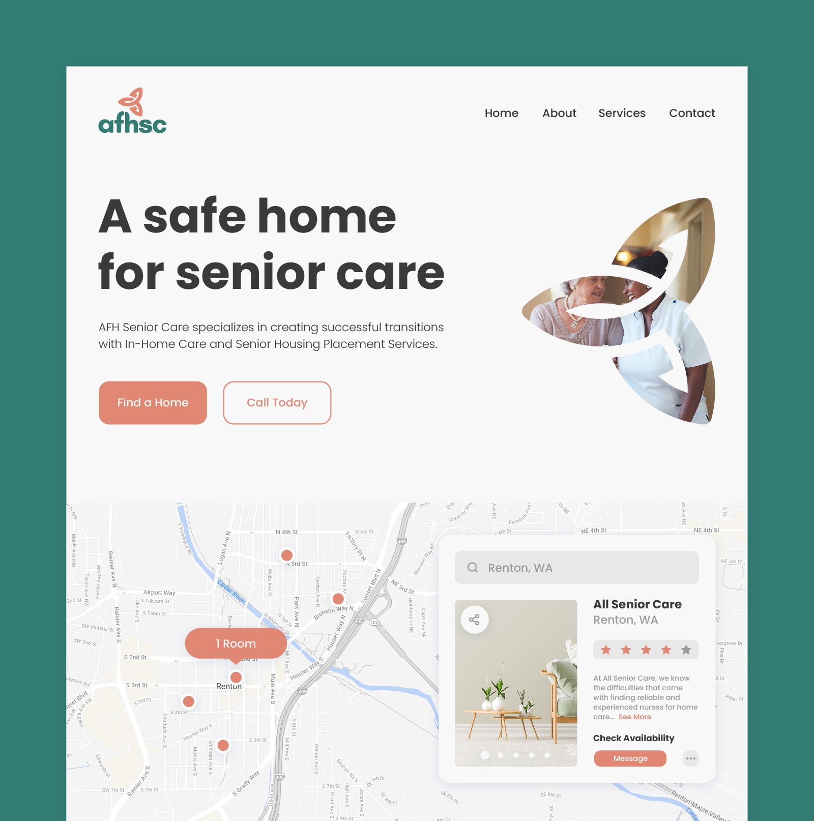
In light of business acquisitions and competitive market conditions, the client recognized the need to improve their branding and online presence. In short, the platform’s goals can be described as follows:
1 Enhance brand's overall perception by staying up to date with design trends, and being first adopters.
2 Design easy to navigate web pages that give customers all the tools needed to make an informed decision for their loved ones.
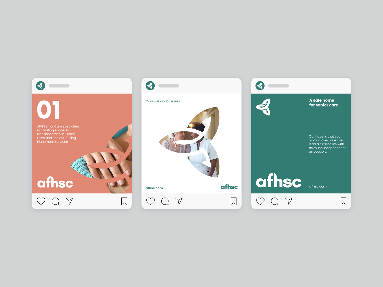
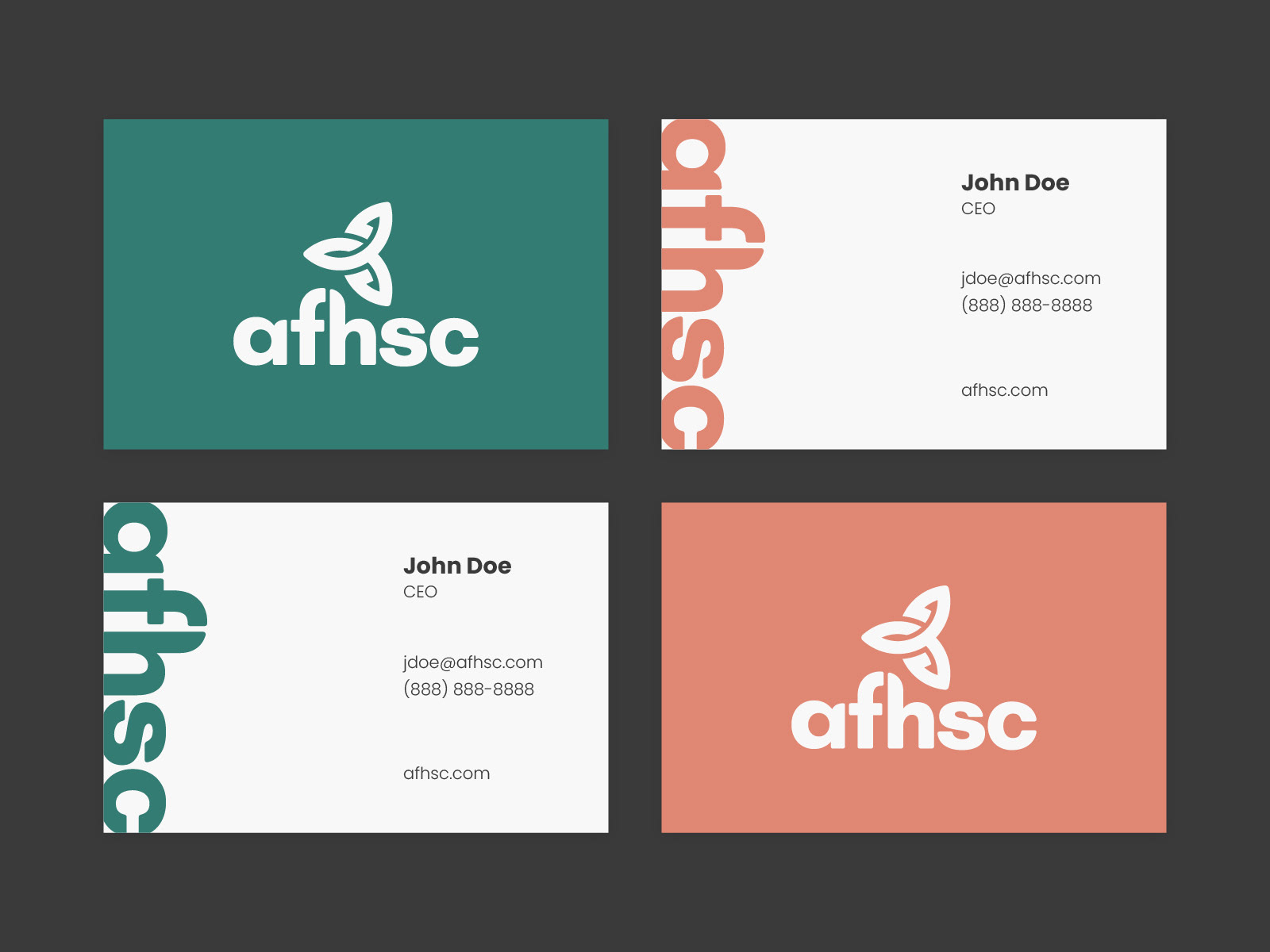
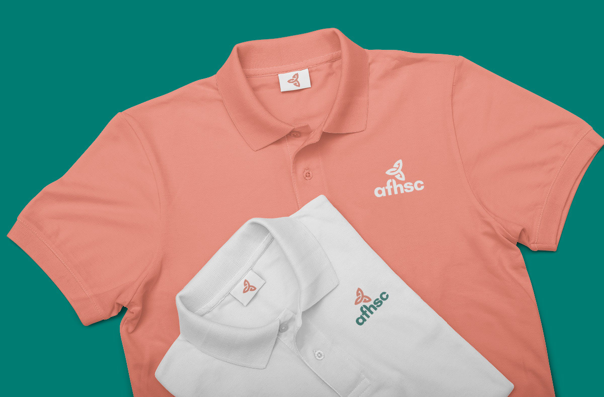
3 Curate a library of digital assets that can be utilized across social platforms and any additional marketing materials.
LOGO RESTYLING
Concept of Compassion
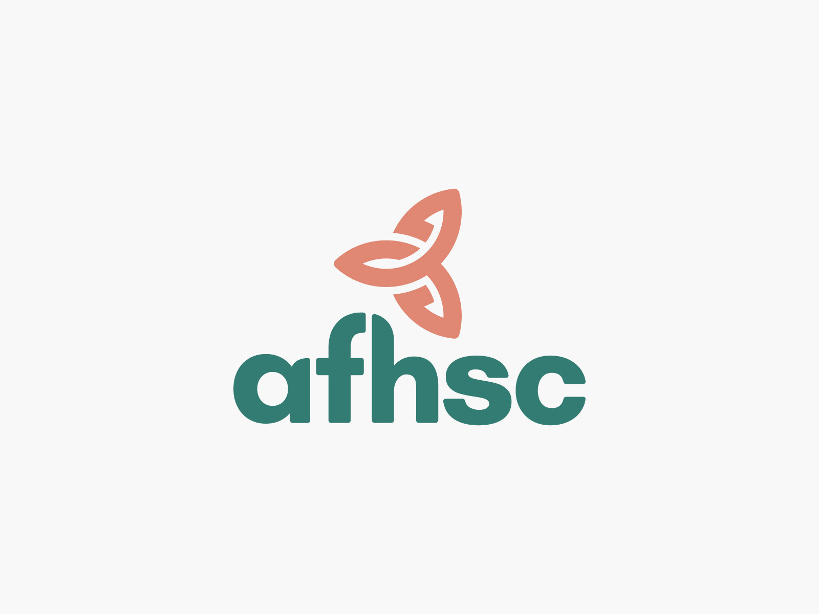
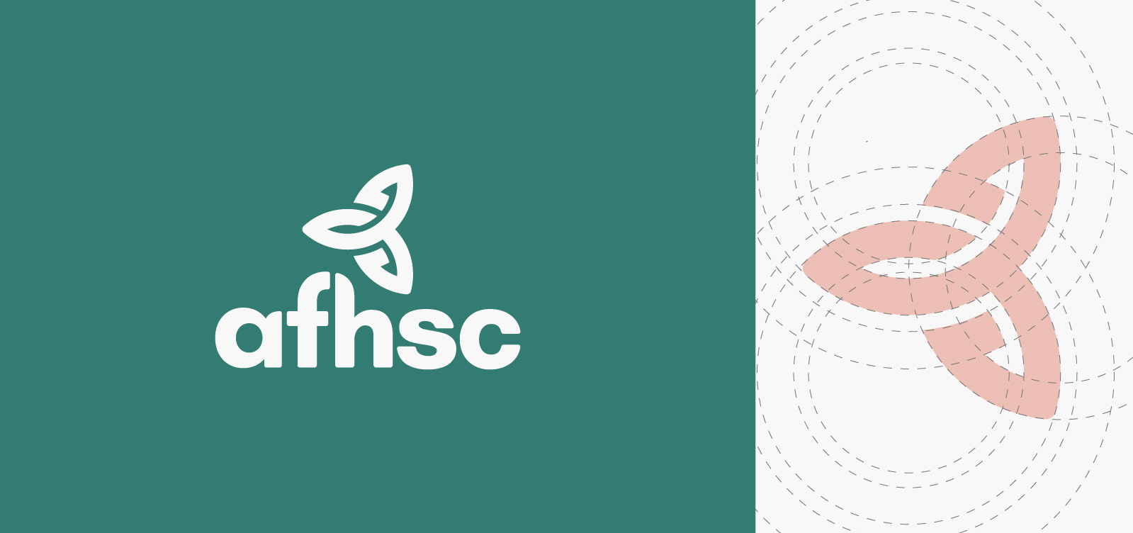
At it's core, AFHSC's mission is to bring care and dignity back to the industry of senior care. To reflect this, I presented a mark that draws inspiration from the Christian symbol of "compassion". Being a heavily Christian based company, it made sense to incorporate a symbol that is recognizable and can be easily identifiable.
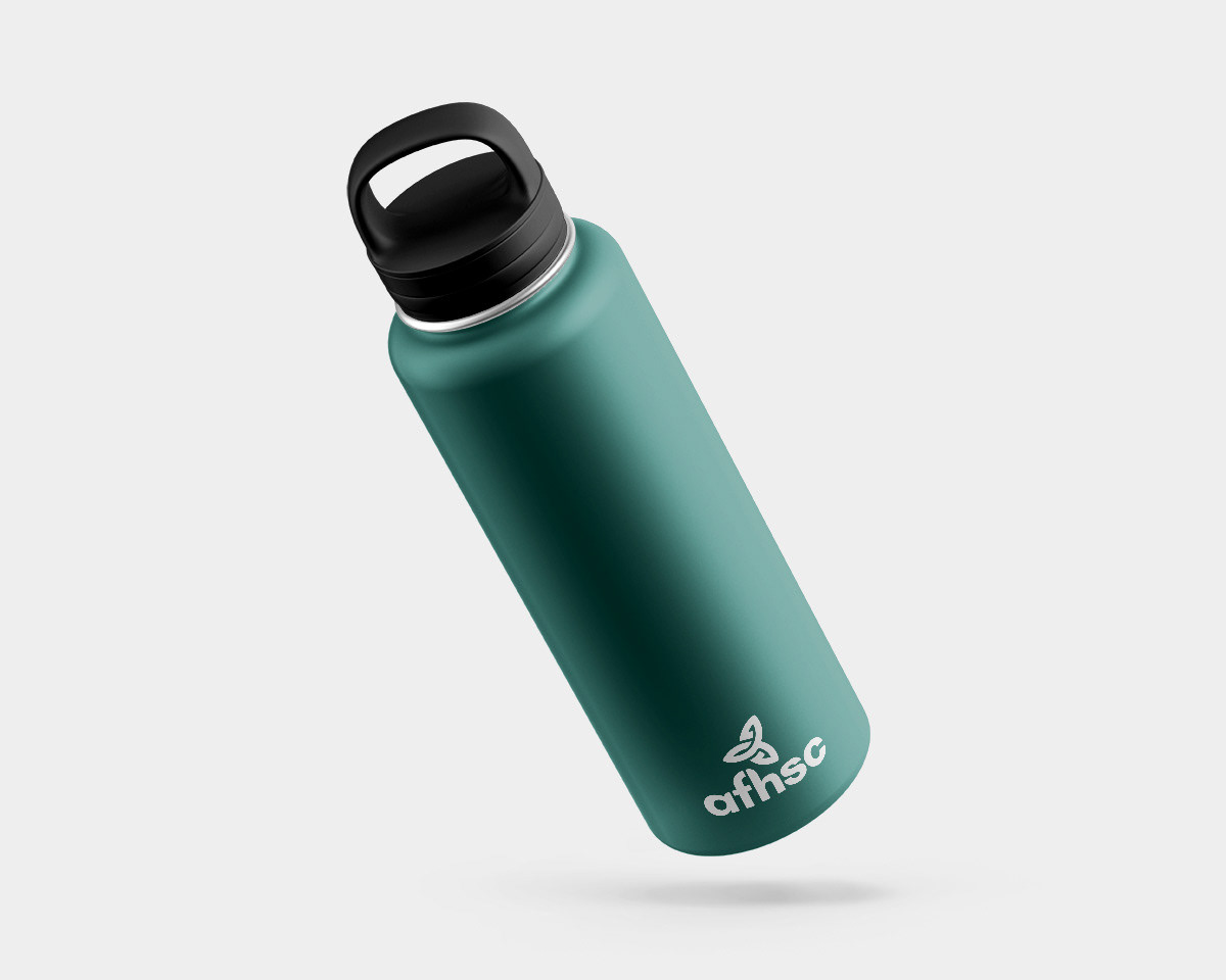
The color "teal" represent open communication and clarity of thought, while the color "Peach" symbolizes vitality, energy, and encouragement. These are vital messages that tie back to the mission of the brand.


FRIENDLY DESIGN
Vibrant Identity
To attract our target audience, we created a distinctive and memorable brand identity that would set AFHSC apart from competitors. I wanted to create a visually appealing website, so I kept the design simple and easy to follow. By incorporating the logo mark in various different styles, it re-emphasized the brand while not overwhelming the user. This made it more attractive to users while focusing on key content and information.